Scribble
A portfolio that moves like ink.
A portfolio that moves like ink.
For an artist who lives by craft, the website had to feel hand-drawn — every scroll and transition as deliberate as a line of ink. We built a bespoke, editorial site where the motion carries the texture of the artist's hand.
What made it hard.
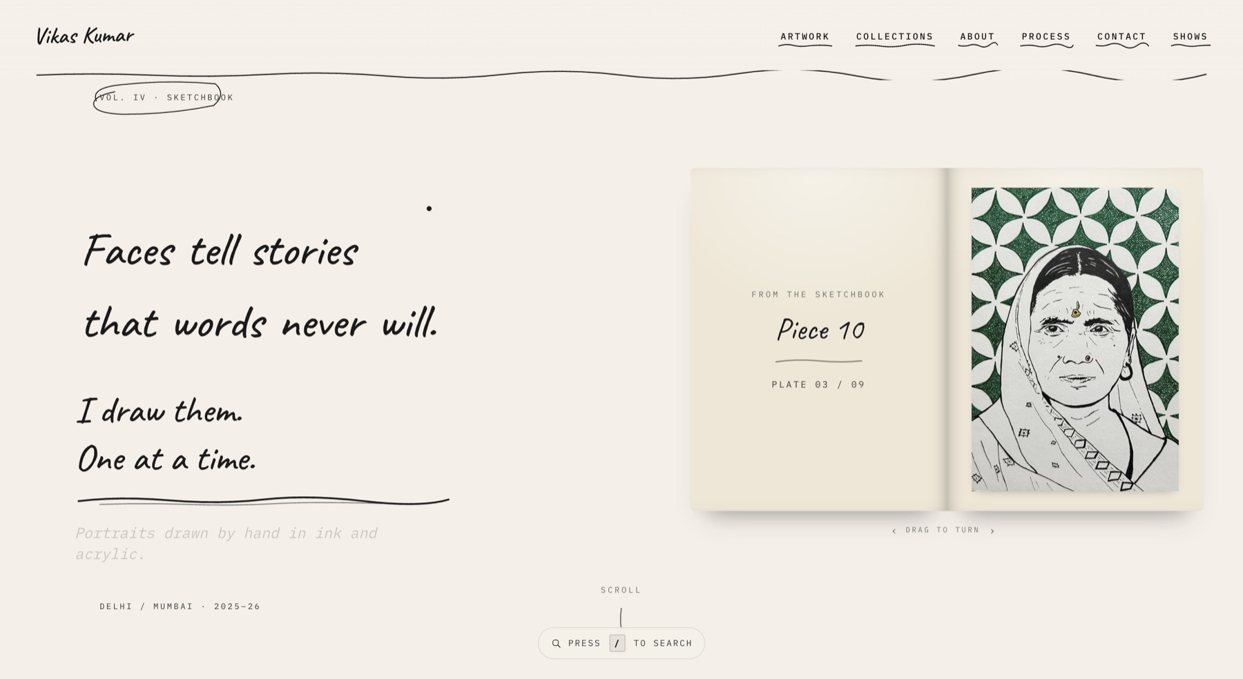
Artist portfolios usually flatten the work into a grid. This one had to carry the pacing and texture of a sketchbook — unmistakably the artist's — without ever feeling slow or precious.
From the hard part, forward.
Find the voice
We treated the layout like a sketchbook spread — editorial type, hand-set rhythm, generous negative space.
Design the motion
Every transition was storyboarded so scrolling feels like turning a page, not loading a route.
Engineer for feel
WebGL and GSAP for the bespoke moments, kept lean so it scores 100 on performance.
Launch
A site that is unmistakably the artist's — fast, tactile and one of a kind.
What shipped, in numbers.
The parts we’re proud of.
Bespoke motion
Hand-storyboarded transitions that read like turning sketchbook pages.
Editorial layout
Type and rhythm set like print, so the work feels curated, not gridded.
Fast by design
A perfect performance score despite the WebGL flourishes.